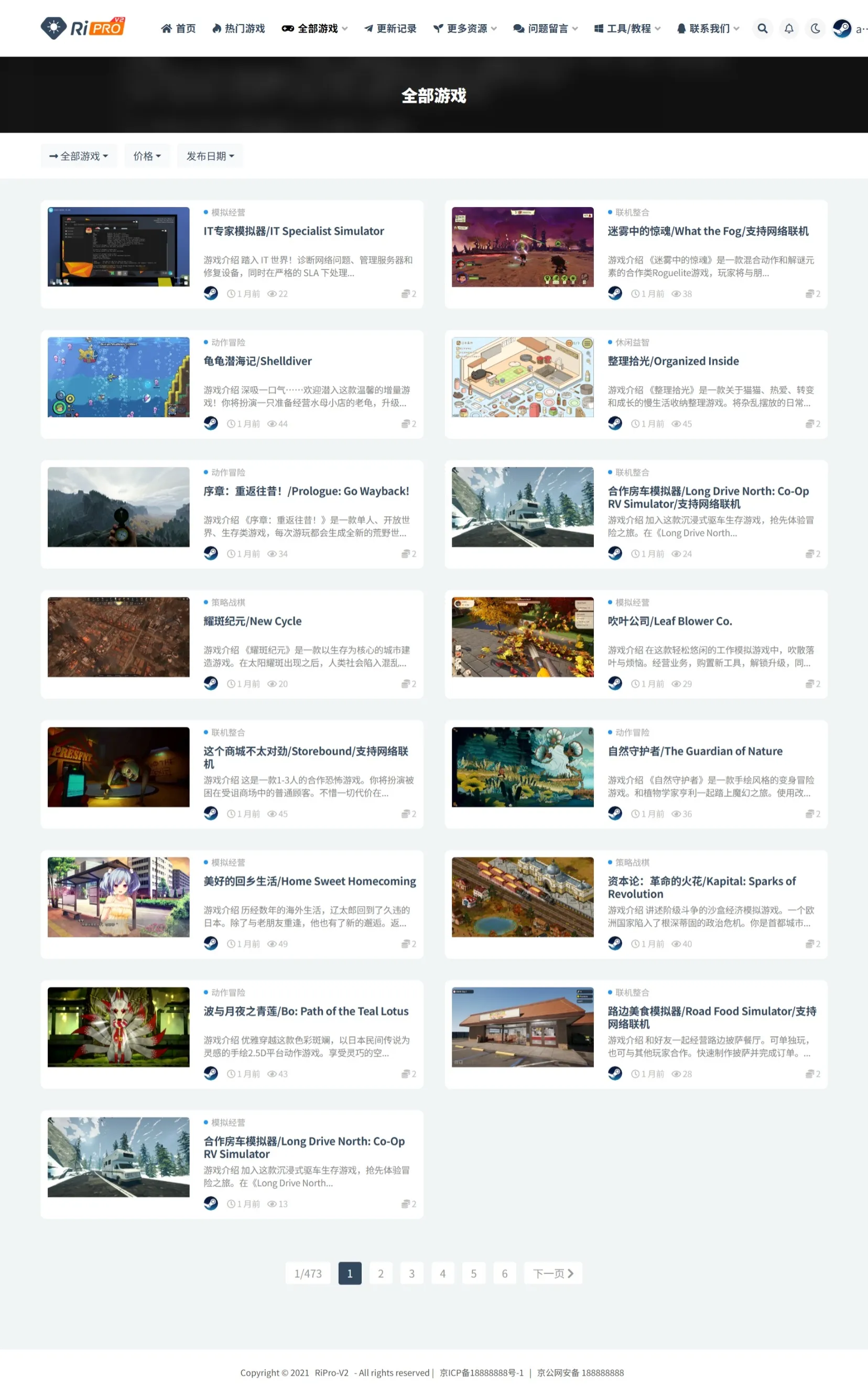
当我们看是用子比主题是,我都会希望(子比主题美化)他能变得好看,就是花里胡哨的,所以我就去了子比主题官网的美化社区看了看,发现了这个美化。下面是在别人的网站的截图,我自己是没有用文章的美化,代码美化你看下面的代码就知道了。
css代码 文章样式
.posts-item.card::before { content: “”; display: block; background: #fc625d; top: 9px; left: 15px; border-radius: 50%; width: 9px; height: 9px; box-shadow: 16px 0 #fdbc40, 32px 0 #35cd4b; margin: 0px 2px -7px; z-index: 1000; position: absolute; } .posts-item.card { padding: 26px 10px 10px 10px; /*注意.posts-item.card没有定位属性 需要把这个注释去掉 position: relative; /* 添加定位属性 */ }
代码样式
.enlighter::before { content: “”; display: block; background: #fc625d; top: 9px; left: 15px; border-radius: 50%; width: 15px; height: 15px; box-shadow: 20px 0 #fdbc40, 40px 0 #35cd4b; margin: 0px 2px -7px; z-index: 1; position: absolute; } .enlighter-overflow-scroll.enlighter-v-standard .enlighter { padding: 35px 0 12px 0; }
© 版权声明
文章版权归作者所有,未经允许请勿转载。